Color Theory in Vector Art: How Colors Influence Design
Color is more than just a visual element in design—it’s a powerful communication tool. In vector art, where clean lines and sharp shapes dominate, the choice of color can make or break a design. Whether you’re creating a logo, an illustration, or a layout for promotional materials, understanding color theory is essential. The right color palette enhances readability, guides the viewer’s eye, and evokes emotions that align with your brand message.
Vector art relies on flat colors and scalable shapes, making every hue and contrast count. Designers must consider how colors interact and what emotional responses they create. A bold red might show energy and passion, while a cool blue can convey calm and trust. Complementary and analogous color schemes help create balance and harmony, ensuring that your design doesn’t overwhelm or underwhelm the audience.
When used effectively, color theory in vector art brings designs to life. It can elevate a basic illustration into a compelling visual story. From choosing primary and secondary colors to understanding contrast, saturation, and brightness, designers who master color theory create more impactful and visually pleasing vector designs. Whether you’re working in branding, digital media, or digitizing services, understanding color psychology helps you stand out in a competitive design world.
The Basics of Color Theory in Vector Art
Color theory is built around three main elements: hue, saturation, and value. In vector art, these components help define how a design feels and functions.
- Hue is the basic color, such as red, green, or blue.
- Saturation determines how vivid or muted a color appears.
- Value refers to the lightness or darkness of a color.
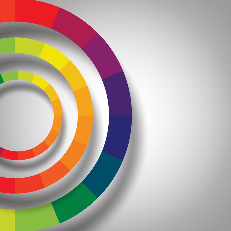
These variables work together to form a complete color palette. Designers use tools like the color wheel to create harmony. For example, complementary colors (opposite each other on the wheel) provide high contrast, perfect for making elements pop. Analogous colors (next to each other on the wheel) offer a more subtle and cohesive look.
Vector illustrations often follow a minimalist style. That means each color has a job—whether it’s drawing attention, guiding navigation, or communicating mood. The precision of vector tools ensures that colors remain crisp and consistent at any size, making it ideal for logos, posters, and vector art services.
Emotional Influence: The Psychology Behind Colors
Every color triggers a psychological response. This is why color choice in vector art goes beyond aesthetics—it influences how people perceive your message.
- Red: energy, excitement, passion
- Blue: trust, calm, intelligence
- Yellow: optimism, warmth, creativity
- Green: nature, balance, health
- Purple: luxury, mystery, spirituality
- Black: sophistication, authority, elegance
- White: purity, cleanliness, simplicity
Using these color cues strategically helps a designer build a connection with the audience. For example, a health and wellness brand might lean into greens and blues for their calming effects, while a tech startup might use black and blue for a sleek, modern feel.
These decisions are critical in creating visual branding that resonates. And when applied to custom apparel or merchandise, such as embroidery services in USA, color accuracy becomes even more essential to ensure your brand identity remains intact.
Color Harmony and Balance in Design
Vector designs must be both striking and balanced. Too many colors can clutter the artwork; too few may make it dull. Color harmony refers to aesthetically pleasing arrangements of colors based on relationships on the color wheel. Some popular harmonies include:
- Monochromatic: Variations in lightness and saturation of a single hue.
- Triadic: Three colors evenly spaced around the wheel (e.g., red, yellow, blue).
- Tetradic: Two complementary pairs, forming a rectangle on the wheel.
These combinations ensure that the design elements work well together. Good balance also includes contrast. For instance, light text on a dark background increases readability and draws attention to key points. Designers often create mood boards or test palettes before settling on a final scheme to ensure visual impact.
When developing vector graphics for branding or packaging, keeping this balance in mind ensures a professional and polished outcome. This attention to detail applies whether you’re designing for print, web, or digitizing services that require precise color interpretation for stitching.
Color Considerations for Various Media
Not all colors appear the same on different platforms. That’s why vector artists need to understand the difference between RGB (used for screens) and CMYK (used for printing). Some vibrant colors in RGB may not translate accurately in CMYK, which can affect the outcome in printed materials.
This is crucial for businesses that convert vector designs into physical forms, such as t-shirts, signage, or custom embroidery. Poor color translation can result in dull, mismatched, or inconsistent visuals, which negatively impacts brand reputation.
In vector art, using spot colors or Pantone guides can help maintain consistency across different formats. For example, when sending your design to a company that offers embroidery services in USA, sticking to predefined color codes ensures the thread colors match your digital design as closely as possible.
Accessibility and Color Contrast
An often-overlooked aspect of color theory is accessibility. About 1 in 12 men and 1 in 200 women experience some form of color blindness. Designers must ensure that all viewers can interpret their artwork clearly.
High contrast between foreground and background is essential for legibility. This is especially important in logos, instructions, or user interfaces. Tools like color contrast checkers allow designers to test how visible their content is under different conditions.
Using icons, textures, or patterns in addition to color is another way to improve accessibility. These considerations not only expand your audience but also reflect thoughtful and inclusive design practices—something every creative professional should aim for.F
Final Thoughts: Mastering Color in Vector Art
Mastering color theory elevates your vector designs from basic to brilliant. By understanding hue, contrast, harmony, and emotional influence, designers create artwork that connects and converts. Every decision—whether selecting a palette, adjusting saturation, or planning for accessibility—shapes how people perceive your design.
As vector art continues to dominate branding, marketing, and digital experiences, the role of color only grows in importance. Whether you’re a beginner or a seasoned designer, revisiting the foundations of color theory can help you craft more powerful and professional visuals.
If you’re looking to translate your vector designs into apparel, signage, or embroidery, choose services that respect the integrity of your colors. At NKEMB, we help brands maintain that color consistency across digital and physical platforms through our premium vector art services, digitizing services, and embroidery services in USA.
Leave a Reply